A couple of months ago, I decided I was tired of my dining room being painted all red, above and below the chair rail. The room isn’t overly large, so all that red made the room feel even smaller. This photo below is the only pic I have of how it looked when it was painted all red. I had just decorated the room for a birthday party I was having for a good friend.

Once I made the decision to paint beneath the chair rail, I decided to have picture molding installed. This pic was taken right after installation. Are you just loving the two-tone action here?

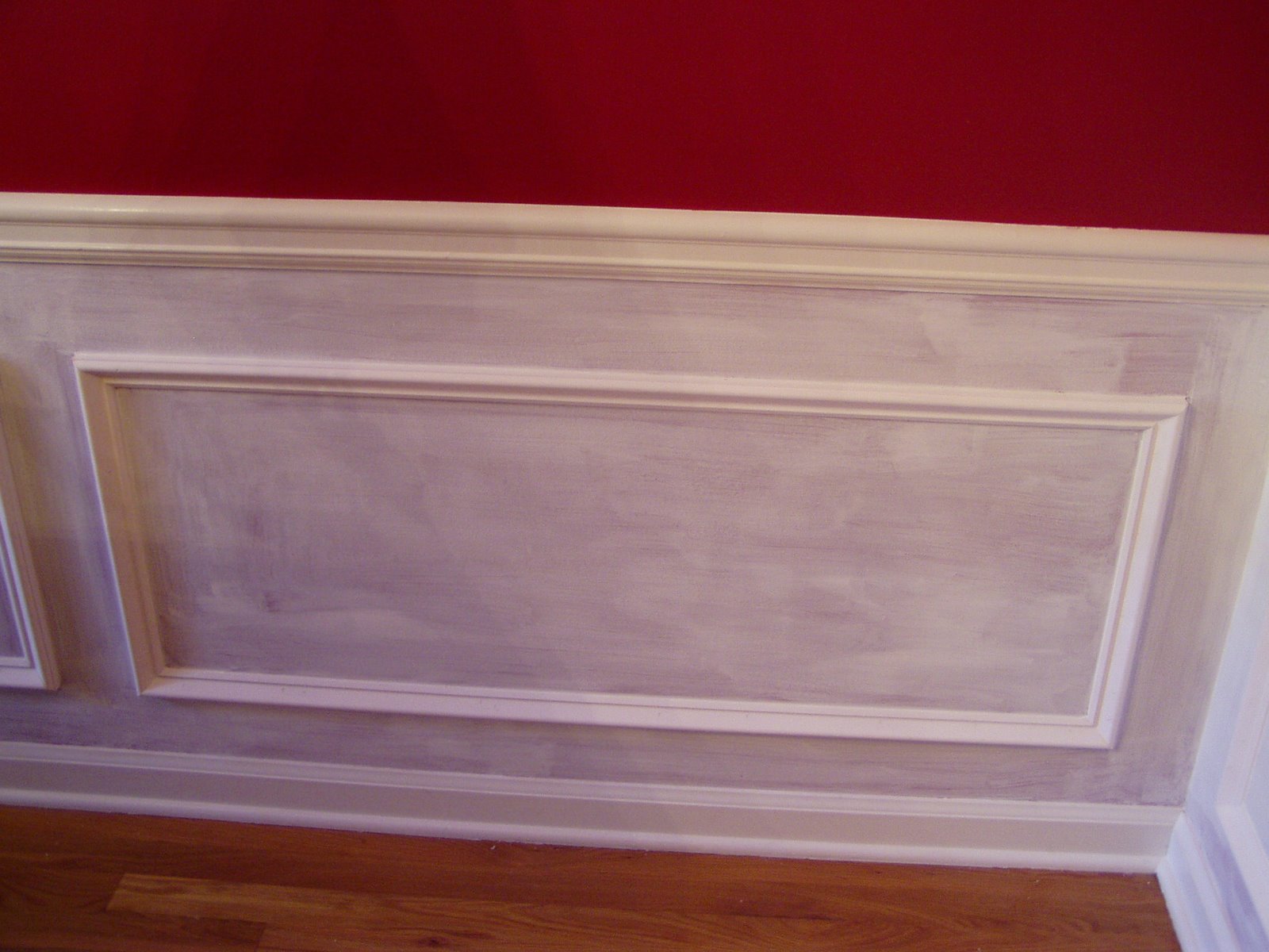
This was pretty painful to look at every day until I finally got a few days off from work and could start caulking all this new molding. (The red is actually a deeper red and not as bright as this picture indicates.)

After I finished the caulking, it was time to prime over the Benjamin Moore “Raspberry Truffle” I had just painted a year ago.

I was getting pretty excited by this point, definitely liking the change I was seeing. I was also a bit horrified that the primer wasn’t covering any better than it was. Ugh, I saw more priming in my future.
Another coat of primer definitely helped cover the Raspberry Truffle.

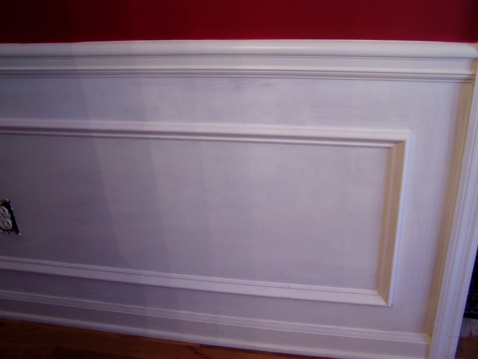
Finally getting to the good part, painting with the paint below the chairrail. Not sure if this pic was after the first or second coat.

The sideboard was still pulled out from the wall in this pic. Note the high-tech furniture moving equipment, dish towels under each leg. Hey, it works. Yep, definitely liking the white below the chair rail. What do you think?

Ignore the table…how’s the wall look?

I can’t imagine this tablescape with an all red wall behind it. I think the additional molding and white paint were a good change, but what do you think? Was it worth all the work? Please say yes, or I might have to cry.


Well, I for one, love the new look. I’m thinking about painting some of my walls a real soft gold. I’m so over this off white look. Good job.
Hugs,
Chris
The answer is a definite yes!
When we constructed our home, 6 years ago this coming summer/fall, the dining room was one of the first projects I wanted the trim guy to work on. No regrets. It makes all the difference, especially when using darker shades of paint. The wainscoting is what makes our Interesting Aqua work. Two years ago we had a cornice made for over the window, also.
You made the right decision. It truly enhances your already gorgeous room and the red!
YES, it does look much better and certainly brightend up the room. Your dining room is beautiful and I love the decorations you had in place for the birthday.
That was alot of work painting over the red and adding the picture molding really did change things up…It was beautiful before, but it is even more so now.
Love it, 😉 Bo
Susan, It looks great! It really brightened up the room. I like the red too. There is nothing like paint to transform a room.
Tracy
Simply one word –
‘BEAUTIFUL’
The white beneath the red looks so rich! I have no red rooms now, everything is going softer but I still think the reds, golds, etc. are gorgeous…I think I’ve just outgrown them for now.
Hope you are having a wonderful New year so far. Did you know Rhoda (Southern Hospitality) and I are going to Scotts Antique Market on Jan. 10th to meet up with Eddie Ross? I want to go to House Parts that day too but not sure if we’ll have the time.
Hugs!
Judy
Love the red/white combo!! As I was scrolling, your foyer pic caught my eye and the two (foyer and DR) look so good together! Not sure where they are in relation to each other in your home, but they certainly work well together. I’ve always loved a red DR!!
Great job Susan – your hard work paid off!!
I have been considering this same project myself. I have berry colored walls in my DR and I am like you in thinking it is a lof of berry! How far from the floor did you put the chair rail? And, why did you have to caulk it?
Susan, You know I love the “new” look. Definetly worth all the work you put into it..I think it puts the finishing touch on already beautiful room. I’ll try to keep those mice at bay, but you know how those pesky little critters are..:-) hugs ~lynne~
Hi Susan, I love the new paint contrast! Looks more elegant and your style! Very pretty! 🙂 ~Rhonda
Oh, yes…WELL worth the work, Susan. I thought your red dining room was as pretty as punch but i do love the white beneath the red. Just beautiful….
xo bj
The trim below the chair rail and the while paint adds an elegance and richness to the room. I love it! It works beautifully with your decor.
I think it looks so crisp and just gives it a “taken to the next level” look. My dining room in our home in Florida was this color and I absolutely loved it. I wondered if it would limit my choices of china but found that even my blue and white floral dishes worked in that room. It seemed to be a very neutral choice that went with everything- a very LOUD neutral:)
I think your style is just beautiful and I would like to leave my kids at home and come sit in your sunroom a while- would that be okay?
I like both looks – and I certainly understand the need for change. My dining room needs to be repainted, too.
A definite “YES” from me! It was already such a pretty room, but it looks much more elegant now. I don’t think you could ever make a wrong decision about decorating. laurie
Yes! Your blog and interior decorating look beautiful!
Yes! Your blog and interior decorating look beautiful!
Definitely worth all the work. Happy New Year again, Susan!…Christine
It was definitely worth the work! I hate to caulk! That’s going to be one of my January tasks in several rooms. I remember when you were doing this work and MIA. How many days did this take? Like three? Or was it more? However long it took, it was worth it. I can’t imagine the all red either. Makes me itchy to get started on mine. Guess the Christmas decorationsb have to come down first. Maybe today!
hugs~ C
Good Morning Susan,
Just stopped by to see your dining room. You definately made the right choice – adding the molding and painting the lower portion of your wall white gives the room a breath of fresh air – so crisp and classic. I have the same treatment in my dining room but painted the upper wall “Old Gold #5” from the Laura Ashley paint collection. Love it! Great taste!
Oh yes, Susan! A dining room painted white below the chair rail is just a classic look to me. Add picture molding…perfect!! It’s beautiful!…Debbie
YES!! it does good much better with the white..I love the moulding it just makes it pop..and Susan I just moved furniture at my Grand daughter home and we used magizines under the legs and it worked!! Hope you have a great day…hugs and smiles Gloria
Well … you ceertainly have no reason to cry. This is amazing. A transformation. Your room looks so much larger and so much more interesting. You did a great job and I am impressed (and inspired too.)
I did the same thing to a red bedroom at my house. I added a picture rail and other trim below. It took at least 3 coats of primer to cover the red and 2 coats of the white paint. I was extremely happy to get finished with that job. I love my new room and especially like the walls, as I’m sure you like yours
It looks great! I, too, have a dark red dining room and I’m wanting to change it. I thought about repainting the entire thing but I really love the antiqued look mine has (like red leather). I think this is the perfect solution! Thanks for the inspiration.
It was definitely worth the work! I’ve always loved the look of that type of molding especially in a dining room. Great job! Sally
Just out blog hopping and came by your charming blog. I will add my YES it looks great. Molding adds that craftsman look to most any room, and especially the dinning room. Good job. TTFN
Don’t cry…it looks wonderful and well worth the many layers of paint! Love that look!
That’s really pretty. I’m definitly looking for something like this when we start our house shopping here soon.
Oh Yes – Lighter is Better!
yes it was worth it, love the sharp clean contrast, makes the table pop~
Absolutely love it! I love the contrast with the red and white, very crisp looking. You did a great job, your hard work was well worth it. Enjoy your “new” room! 🙂 Michelle
Looks good. I like that bit of contrast you got going there. Good job!
It certainly did dress up the wall perfectly! Isn’t it amazing just how small touches such as the picture moldings can make a world of difference. ~ Robyn
Love, love, love it! What a remarkable difference. I flew home reading an Architectural Digest and it really made me want to change some things for the new year. They are sure showing a lot of draperies, and I am thinking they would really soften my living room(aka great room)along with a soft tint on the walls. That’s one room I really haven’t shown as yet, since it feels unfinished to me. You have inspired me once again Susan, thanks! Jan
Oh I love the new look!!! Much improvment! Nancy
Yes, definitely worth it. I can just imagine all the folks (me included) off to get the measuring tape and eyeing up our own walls. Thanks for the inspiration yet again. Happy New Year, Elizabeth
Definitely worth all the work!
Very well done, Susan. And an excellent choice. In our other house we had a brick colored wall that just made me so happy! I don’t think I would have liked it as well if it covered all the walls floor to ceiling.
I love what you do with your decor period. I haven’t seen anything I don’t like!! It’s all beautiful, and this table setting needs to be on the front of a magazine!!
Joyful blessings to you,
Becky
I love the new look! You are so talented! I like the way your table is set also. My birthday is Jan.14, want to host a celebration at your home for me?LOL!
ginny
It’s GORGEOUS!!! It gives it such a beautiful architectural look. Thank you for the inspiration! I’ve always wanted to try that. You make it look so easy.
Donna
It’s GORGEOUS!!! Not only have you added beauty to that room, but value as well. It adds such texture. I’ve been wanting to add moulding and trim to my daughter’s room. You made it look so easy. Thanks for the inspiration!
love it — I love all red… but the white is so fresh.. looks great … great job!
Celebrations in 2009 for you!
Pat, I love it! I think it looks amazing! Beautiful!
I have the same “paneling” molding in my dining room…and I love it!
Hi Susan,First thankyou for your visit to my spaces at rms and all the lovely comments you left me.Now about the wainscotting,Beautiful and the perfect choice.I have that treatment in my entry and guest bath and hopefully soon in my Living room.It is so classically traditional and lovely.Red is a hard color for people to live with even though must of us love to look at the color.I stayed in a B&B In VA. once and the room was all red and it took about 10 min for me to realize I couldn't live with an all red room.At least you gave yourself more time before the change.I think it was a good choice.Do you see yourself changing the upper half any time soon?I know in the spring our decorating wheels start going fast forward, I wonder what the spring will bring,hmmmm???Kathysue
It was soooo worth it Susan!!! It looks spectacular.
I was so happy to see this today, Susan! I have red in my DR & a chairrail too with red above & below & THIS project is on my to-do list. I have a miter box & I'm going to do it myself sometime this spring. I love how yours turned out! Great look!
I love it! It looks beautiful! It really brightens it up!
It looks gorgeous! The white is so crisp and fresh against the red. I’m going to be painting our darling daughter’s room this year, it is currently purple (and I mean screaming purple, not pretty little lavender lol)and now I know to count on at least 2 coats of primer! Kathy
I love it, and I think that the red is gorgeous. Stunning room!
Susan!
You did better than good, you did GREAT! Thanks for stopping by my blog. Nice to meet you.
Happy New Year!
Sandyt
Susan,
I agree, it’s a much nicer look. I love red, but after a while it can be a bit much. No need to cry my friend, you did good.
((((((Hugs))))))
‘D’
I just love it! Wonderful idea/choice! The work was definitely worth it. Pat yourself on the back and give yourself a standing ovation!!!!!!!!!! Hugs, Pinky
No doubt about it, the white is a great lift to the room. Have you thought about wall papering inside the shapes created by the picture mouldings? Maybe something rich and flocked to join the two colours together? Just a thought but the white is definitely better:)
Work well done! Tough job, covering all the red. I think you made the right choice, for I love it this way! Cheers!
Hi Susan – You did a brilliant step-by-step workshop in adding architectural interest to a room. I think I could do it! Your photos are not only helpful, but inspirational. You had to have perseverence, since it’s a bending over, kneeling on the floor or down on your hands-and-knees much of the time. But you’ve added value to your already beautiful home. Fieldstone/Pam
love the look of the room. makes it appear much larger and very elegant. great job!
I love the addition of the white….very crisp! And I cracked up at the “sophisticated furniture movers”….I’ve done that for years and then finally treated myself to a set of the round pad like things. I have wood floors and it really keeps them from getting scratched. Usually, I’m pushing around furniture in the middle of the night….LOL! PLUS, I love the beautiful mirror in the dining room! The whole room turned out really nice.
Hi Susan
I love the new look in the dining room. Our dining room is red above and white below also.
Hope 2009 is a wonderful year. I have really enjioyed reading your blog this year. You have such a beautiful home.
Hugs, Rhondi
Seriously…A wise and lovely choice!
There is no question; White.
Now this gives me the wow factor I always want. Lovely
Blossom
I LOVE it!
Wow! I love the new look. It’s lovely.
Teacup Lady (Sandy)
Hey Susan; WOW OH WOW!!!!
At first when I read that you were going to paint a different color over you lovely red, I thought oh no I love that color. Well I am so wrong, I so love the cream white on the bottom, it looks like a whole new room. you did a great job.
now come and do mine…. lol
have a great weekend.
hugs
Alaura
It looks so nice. Your dining room is really beautiful and so gracious looking. It must have been a lot of work.
Roberta Anne
It is, in a word, SUPERB! Definitely worth all of the work. The white just makes this room pop. I think everything in there is going to look so much better. Well done!
Yes, it looks good! Please don’t cry! :O)
Susan, I love the white at the bottom of the wall. It really sets off the red. Great job!!
Hugs, Terrie
I do the dishtowel thing, too. And I’m into caulking. ::High Five::
Love your chair-rail–it’s beautiful!
I really like the look as well. The color contrast is very nice and the added picture molding is a really classy touch.
Valerie
I LOVE it! I know what you mean about getting tired of all the red.. I have a similar problem with a great room painted red… I’m struggling with what to do; I feel like I’m walking into a blood clot everytime I enter the room… I just don’t have the nerve to tell my husband that we’re starting another new project…
Love what you did to break it up; looks great!
Amazing job. So glad you finished before the first of the year. You may or may not know the old wives tale that whatever you do on the first of the year you will be doing all year long.
Thankfully it won’t be working on that gorgeous dining room. Hopefully it was something that brought you a great deal of happiness and pleasure.
Susan,
I love your picture molding with the white paint. It really does break up the room and gives it a really elegant feel.
You did a great job and I love it! It’s always good to keep a room evolving.
Gretchen
http://www.birdnestcottage.typepad.com
Susan,
The picture molding trim painted white just makes the room perfect. It is so crisp and elegant looking.
You did a great job and it was well worth all the hard work I know it took.
Gretchen
http://www.birdnestcottage.typepad.com
It looks great. In our last house, I had the top painted red and the bottom was white. I love the look.
oh, you did not make the wrong choice…it looks so nice. It’s perfectly elegant.
Suzanne
Very, very pretty! It is a completely different look! It is very elegant and comfortable at the same time. Small change with a grand outcome! ~Cheryl
Yes, you made the right decision. The white and red looks wonderful, you still have the drama of red, but softened with the white below. Great job!
What a beautiful improvement! Great job!
Hi Susan~
It looks wonderful! I have the raised panels in my dining room as well, but all of my walls are all still the builders Linen white. A whole house winter project!
Carol
Stunning! I love the red and white. Wow what a great job you did.
Yes! I love it! Will you come and do mine? I still have all white walls. I can’t seem to get myself to change to another color. lol Your home is just georgeous!
Angela
Susan, it’s gorgeous, of course! Connie/puddin07
Susan, Your beautiful room because absolutely stunning! You rock lady! ♥ Diane
I love the change,great decision..and I can imagine all the work…your home is lovely! And how welcoming your pineapple vignette is…I know you said forget the arrangement…look at the wall…but I JUST had to!
It is beautiful! You made a great choice.
I visited your blog for the first time today, love everything you do.
Wendy
Susan it looks great!! I have a project in mind for the New Year too. It’s in my mind, but my muscles, that’s another story!
You did a wonderful job…
All I can say is Gorgeous! I once had a dinning room with just one accent wall done in red. I am still working on my Dinning in the new house. Just need to find the will to push myself to tear down this old horriable wall paper left behind from the previous owner. The moulding gave it a even more richer look.
Cheryl….Snatch JOY!
Oh I love your new “wainscotting”. Yes the white below loosk wonderful and I am in aww and drooling over your lovely lovely table setting too. I had to stop looking at your beautiful table to admire your beautiful walls! Job well done!!!
it looks beyond fabulous~ I love it!!! and I love your venetian mirror!!!!!!!!
*Beauuuutiful difference there, Susan! (Then again, we're SPOILED by you & have come to EXPECT that, Sweets!). Warm, healthy (still home sick w/ bad cold) hugs, Linda
Absolutely stunning!!!! Beautiful job Susan.
Though a few days late…..I wish you and those who you hold close to your heart A VERY HEALTHY, HAPPY & PROSPEROUS NEW YEAR! Many hugs
-Brenda-
I’m so enjoying exploring your blog! Your rooms are amazing! This paint job is such a delightful change!
Susan – this is exactly how I did my Morning Room, and I get more compliments on this space than any other. I love how the crisp white just embellishes the red. I used Laura Ashley’s Cherry. The difference is amazing!
*GASP*! wow, In one word 🙂 ok, lol, maybe 2 🙂
SIMPLY STUNNING!!!
ok, maybe 3 🙂 GORGEOUS!
Happy new Year Susan too! Hugs, Cynthia
I love the way the room turn out.. Very much alive!
LOVE the way the room turned out. I have been wanting to paint one of my rooms red but, am so afraid of that big of a commitment. Like you, I think the primer would be out in a year. I change things so often that one strong color may box me in more. ???????? But love RED! Hmmmm. Choices a girl must make. Heck it’s only pain right? Love your new look.
YES! It was definitely worth the work! It looks fabulous! I love the Raspberry Truffle color…I used that color in a clients home in a small study…it was fabulous there, too!
I have a paint/paper project I’ve been putting off, too…a bit bigger than this…ugh!
Great job!
Susan, I was thinking when I first saw the walls of your dining room how much I loved the white at the botom! So yes, I love it! I am also looking forward to your post about your porch:-)
That is such a wonderful, vibrant red! We think it would make a great entry in our “Share Your Project” contest. You can win up to $2,700 just by uploading your project description and the before and after photos you’ve already taken. We hope you’ll consider submitting your project!
For more details check out: http://www.repair-home.com/project/
My dining used to painted exactly like your new combination and I loved it! Great job!
By any chance do you know the name of the artist and the name of the painting for the lovely fox hunt painting hanging in your dining room?
The information on the bottom says painted by G.D. Rowlandson. The name of the painting is A Business-like Trio. And in tiny writing just underneath the painting on the right side it says: Entered according to act of Congress in the year 1900 by Louis Wolff & C:in the office of the Librarian of Congress at Washington. Hope this helps. I’m not sure what that capital C with what looks like a colon after it, means.
I know I’m late to the party, LOL…but I just wanted to say that painting white below the chair rail is everything and it looks amazing! Great decision! 🙂