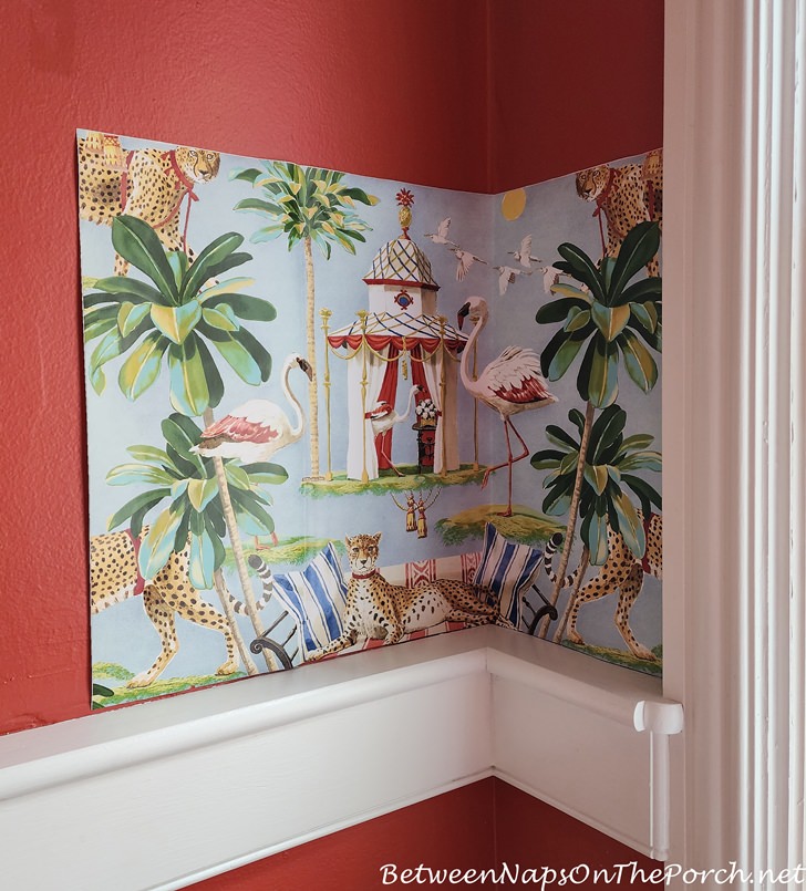
Welcome to the 867th Metamorphosis Monday! A few months ago, I chose this whimsical wallpaper for the 1/2 bath that’s located on the main level of the Dollhouse. Why haven’t I had it installed yet?
There are two reasons: Reason #1. The wallpaper installer requested I choose the white paint he’ll need for the lower half of the wall, and I don’t really have a good way to match to the existing white trim in this room. Unfortunately, there’s no great place to remove a small piece of trim to take it to the paint store for matching. Reason #2. At some point in the past, this bathroom was renovated, and a pedestal sink was installed, leaving a large gap in the baseboard molding where the previous sink/cabinet once existed.

I’ve managed to solve one of those issues. A few weeks back, I discovered a very old piece of trim in the garage that I believe may have been removed from the Butlers’ pantry when it was renovated. I hired a handyman a week or so ago to repair seven issues around the house, and one of those was replacing the missing baseboard molding with a piece of this baseboard. So that issue has been addressed. Now I just need to choose white paint to go below the molding.

In the meantime, while I’ve been trying to come up with the easiest/best way to match to the existing bathroom paint, I’ve decided to add wallpaper to this small mudroom that’s located just off the garage. I’d like to have both rooms wallpapered by the same person, at the same time, so I’ve gone on another online wallpaper search.

I first turned to Thibaut since they usually have wallpaper designs that I love, but this time I didn’t find anything. The wallpaper company that I kept coming across with patterns that captured me is Painted Paper. I know nothing about this company, other than I love a lot of their wallpaper designs. Before I share the designs that I’m considering, here are two wallpapers that I found at Painted Paper that I like but don’t plan to use. I wish I played tennis because I love this wallpaper! I love the textured-looking background and love the vintage rackets! Is it necessary to play tennis to use a wallpaper like this? lol FYI: As I share the wallpaper that I love from The Painted Paper, if you wish to read more about any of these, visit Painted Paper HERE and do a search for that wallpaper by name. This wallpaper below is called Tennis Club.

Another paper that I think is beautiful is this gorgeous sky/tree paper named Leocadie. They have another similar one, but a bit moodier called Ottoline, so if you like this one, do a search for that one, too. I may end up ordering samples of both of those to rule them out for good.

One more paper that I was tempted to order a sample, but didn’t, is this one named Pineapple Parade. The picture I saw at Painted Paper of it in a room was sooo pretty! This would be great in a front entrance hall, especially going up a gorgeous, big stairway!

So far, I’ve ordered 5 wallpaper samples from Painted Paper. This one is beautiful but may be a bit fancy for my modest/cozy English cottage-style home. It’s called English Village. I wish they had a wallpaper that featured English cottages in a similar setting. What do you think, could you see this in my mudroom?

The mudroom can feel a bit dark since there are no windows in that room. This wallpaper would definitely brighten it up, and since the door out of the mudroom leads to the garage and the backyard garden where I have birdfeeders hanging, maybe this would be a great choice. I’ve ordered a sample of this one, so we’ll see how it looks when it arrives. This paper is called Meadowhall.

Another pretty paper that I’m considering, although the colors look brighter in this image than they did when I ordered the sample. lol

Here’s a better example of how it looks in this image from the Painted Paper website. Isn’t it beautiful in this mudroom, especially paired with that dark green bench! This paper is called Sullivan.

Image from the Painted Paper website
Orange is normally my least favorite color, but I love this village scene featuring adorable tiled-roof cottages and lots of pretty florals. Maybe the orange would grow on me. It would definitely brighten up my small mudroom. This paper is named Maureen.

I have soooo many squirrels in my garden. They visit daily to eat the seed that falls to the ground around the bird feeders. So in many ways, this paper would be appropriate. Maybe I should name the Dollhouse, Squirrel Cottage. Ha! This paper has a cute name: Autumn Scurry.

I will probably order more samples since there are so many wallpapers at Painted Paper that I like. Again, to see any of the wallpapers that I’ve shared in this post, visit Painted Paper HERE and use their search box at the top of the home page to search for the name of the paper or for a “subject/design” that you like. For example, if you are looking for wallpaper featuring flowers or trees, do a search for “Trees” or “Flowers” or “Gardens” or “Dogs” and a whole bunch of wallpapers will pop up with those designs. (There are so many cute wallpapers with dogs, deer and other animals!) I found that works better than using their “category pages which seem to leave out a lot of the great papers they have available.
By the way, this isn’t a sponsored post, and I’ve had no contact with Painted Paper other than ordering some samples from their online site. I just love the dramatic and unique wallpapers they carry, so wanted to share. They have so many beautiful ones, including plaids and toiles. I may consider one of their “damask” designs for my small front entry. They have some really pretty ones! Once my samples arrive, I’ll share some of those as I work on choosing a wallpaper for the mudroom.
Looking forward to all the wonderful Before and Afters linked for this week’s Met Monday! Like to know when a new blog post is up? Subscribe for email updates (it’s free) and your email will never be shared. Subscribe for free email post updates here: Subscribe.
Metamorphosis Monday: Metamorphosis Monday is a party that’s all about Before and Afters. Please link up your Before and After projects like DIY projects, room makeovers, craft projects even recipes. Please do not link up Table Settings; save those for our Tablescape Thursday party on Thursday. If you are participating in Met Monday, link your post to the party using the “permalink” to your MM post and not your general blog address. To get your permalink, click on the name of your post, then copy and paste the address (that shows in the address bar at the top of your blog) into the “url” box for InLinkz when prompted.


The ones with the flowers and birds has the lighter look of your cottage. I also like the paper with the squirrels. The English houses and cottages don’t quite seems to fit in my eye…..nor the others. I think you have to think of the overall feel you are seeking to create in your home. Just my two cents.
Downtown abbey called and wanted their wall papers back..lol all the papers are beautiful and have a historical feel. My picks are the birds meadowland and the cottages in Maureen. Forced to pick I would go with Maureen i good luck
Beautiful papers. Meadowhall with the white background would compliment all your coat colors.
The Moody look is fabulous but with a red coat, yellow, black etc…it may not look as curated as desired.
Can’t wait to see whatever look you choose!
So hard choosing wallpaper! Thanks for that input, Teresa. Teresa, will you let me know if you get this reply in your Inbox? I’m hoping it gets through with some changes I made at the blog today.
Hi! Perhaps a William Morris styled paper in the half bath. Those are very intricate and colorful, and very much in keeping with your cottage. I’ve been very tempted to use a Morris styled paper but my home is very much like your Atlanta home, and perhaps the Morris and 18th century would clash. In fact, I think we have the same dining room chandelier!
Happy hunting,
Catherine
Squirrels or Flowers & Birds (in that order, lol). They would both lighten up the area. I think the others are too dark or moody. Can’t wait to see what you pick!
For the mud room wallpaper, I think I’d go with the trees or the squirrels. They’re all gorgeous, but some seem a bit formal for a mud room – though you have such a good eye and I could be completely wrong.
When I need to choose paint, I just go to the hardware store (in my case Lowe’s or Home Depot) and take one of each of ALL the paint swatches in the color family, even if I think it’s 99.9 % certain some of them won’t match. Once I choose a color, I take the unneeded swatches back to the store when I go to buy the paint. I know I’ve left a store before with upwards of 50 little swatch cards :).
Cast my vote for “Sullivan”, please!
How could you not choose the scurrying squirrels… they would absolutely love to greet you coming & going!!! On the other hand, I think my husband would divorce me if I put up squirrel wallpaper because he is constantly chasing them off of our deck so they won’t chew on our furniture. 🙂
lol That’s how I feel about the squirrels that visit my deck in GA. They literally ate my outdoor furniture there that was brand new. I think I got to use it twice before that happened. I ended up donating it because they ruined the arms. So I def have a love/hate relationship with those guys. So far, the squirrels here have stuck to eating the fallen seed, but I don’t have outdoor furniture yet, so that could change.
I think the flowers and birds seem to fit your style. I like Maureen but since you don’t like orange, definitely don’t get that one! Haha
Thanks for taking us on your decorating journey!
Thanks, Carolyn! That is such a cute pattern.
Meadowland for sure!
Just another random opinion, but British countryside is pretty much at the opposite end of the spectrum from the whimsical British Colonial leopard wallpaper you planned to use in the bathroom. The pineapple wallpaper would be the closest one if you wanted to have some cohesiveness. Because your tastes seem to be fairly traditional based on your rugs, furniture and especially the furnishings in the GA house, it seems like something to consider. We had wp installed in 4 bathrooms when we renovated and even though I am a traditional design person I chose paper that was modern but leaned traditional too so that my bathrooms look updated but cohesive with our antiques and Persian rugs. (Stripes, geometric and block patterns) It’s expensive to buy the wp and equally expensive to have it hung. Thibaut has great quality and designs.
Yes, I agree. That’s a great point, and I did think about that back when I chose the wallpaper for the guest bath because my current living room furniture in Georgia would never work well with the whimsical bathroom wallpaper I’ve chosen. So if I ever move that furniture here, they will be very different in style, but thankfully, the two rooms are in different areas of the house, so you can’t see one from the other. To reach the guest bath from the living room, you have to leave the living room, go into the back staircase area, turn left and head down the hall toward the Butler’s pantry, so there’s a bit of separation. I want the guest bath to be a bright, playful surprise, so I’m okay with it feeling different from the rest of the house. I know a designer/decorator wouldn’t like that, but I don’t mind.
In the Georgia house, I was careful to choose a wallpaper that went well with the living room furniture/colors in that paneled room since the guest bath is down a short paneled hallway that’s right off the living room. You can stand in the living room, and if the door is open, you can see partway into the guest bath. So I went with a Thibaut pheasant/woodland paper from their Fall Hills Collection called Brandywine for that bath. It works well with the colors, furniture, and style of the living room.
My least favorite wallpapers are the geometric and block prints. I don’t like any of those.
I did get an estimate a few months back for wallpapering and painting the guest bath by the same man who has worked in historic Hawthorn Hill, the Wright Brothers house. His quote was $800 for the bath, so not too terribly bad. I imagine it will be around that or maybe a little less for the mudroom since it will a bit less involved.
Absolutely LOVE the squirrels for the mud room. They would bring such a smile to my face every time I went in or out.
All the papers are gorgeous but the Squirrel Cottage wallpaper is so charming. Can’t wait to see what you choose.
You have probably already considered this, but for the paint matching issue, is the laundry chute door the same paint as the trim? If so, can it be easily removed and toted to the store?
I think it is, but the door is part of the frame/design of the laundry chute. It’s all one piece that is installed into the wall with the chute itself. I found one paint that is close. I may just have to have all the trim repainted. Thanks, Kat!
I would not use seasonal paper for either of the small rooms. That would be over play for the whole year.
Wellll…I love the trees (my tree mural is waiting t/b hung in tv room…patience!) Just fyi…Personally, I would not like squirrels running around my bathroom …but to each his own.
I do ❤️ Wm Morris…*sigh* franki
This paper would be for the mud room, not the bathroom. You made me laugh, Franki with the “squirrels running around the bathroom.” LOL
I like the Sullivan the best with your flooring. However, I don’t think it is a great choice to go with the bathroom wallpaper if you are looking for the two rooms to flow. If this was my home I think I would look for something that mirrors the bathroom paper or not paper at all. Maybe a new paint color could be what you are looking for?
I really want to add some personality to this tiny little mudroom and paint just isn’t going to do that for me. The door def needs a new coat of paint. The old chain lock that was swinging back and forth for years and years has damaged the door and the trim. I don’t know why it wasn’t removed when it started digging into the 87 year old trim around the door.
Susan, my contractor has an app on his phone or some device that he shoots to the exsisting paint and it identifies the paint color. Ask the paint store about such a tool. Good luck. Love the wall paper choices.
I love the squirrel and floral with birds for your mud room.
They are so adorable. I also like the tennis paper, very very classy, and no ….you do not need to be a player. lol ?
Whatever you decide on I know it will be fabulous. You have such a keen eye and fabulous taste.
Is Tennis Club the prettiest paper?! It feels so old world elegant and classic! I love it!
So many pretty papers that I find it hard to chose.
Thanks so much for hosting this wonderful party!! I really appreciate the time and effort that goes into it along with visiting all the links!! I hope you are having a great week!!
Hugs,
Deb
Debbie-Dabble Blog
Could you “freshen” the trim in the bathroom when you paint the walls? You could take a shutter to the paint store and match the shutter (or just call the shutter company and get the same paint as they used).
I’d choose the squirrels then birds – the squirrels because it’s “less busy” for a small area and seems more “mud-room” – and the bird because it’s “pretty” and has a lighter background. I’ve found that small areas with “darker” walls (than classic white paint LOL) seem smaller and more closed-in than they are. We painted over forest green walls with very light paint and you’d have thought we had added square feet to the room. Will you have any wallpaper or graphic fabrics within sight of this area that you’ll want to coordinate? Can’t wait to see what you choose! You amaze me!
I thought about that but I don’t want to risk getting a scratch or any damage to the shutter. I may end up having to have all the trim repainted if I can’t match it. Once I choose the wallpaper, I will probably have the bench cushion covered in a coordinating pattern. Thanks, Margaret!
Oooh wallpaper! I love it all – so many fun choices. Someone should have one of those personality quizzes based on what wallpaper a person chooses! I can’t wait to see what you settle on. (And no, I don’t think you have to actually play tennins to have tennis wallpaper!) Thanks for the fun today, and as always, for hosting!
I love the moody Sullivan for your mud room, but not the brighter one. It will be easier to decide when the samples arrive. I guess I’ve forgotten, but why not repaint all of the white in the 1/2 bath rather than try to match the existing? Once you’ve decided on your wallpaper you can easily bring a sample to the paint store.
I may have to do that. I do like the paint color in that room.
Hi Susan, I’m jumping in quickly so I’m sorry if someone else has suggested taking the laundry chute door off and having the paint color matched. I love bold wallpaper but for the entry I vote for the flowers and birds. The entry appears to be pretty dark. That paper is lighter and just seems to say “Hi, you’re near the outdoors.”
I really like your wallpaper choice for the powder bath. Suggestion: instead of trying to find the perfect white you could use a light blue that has been matched to the background of your wallpaper and use it to cover the wall, chair rail, and baseboard.
Is there a way to take one of the shutters off? Just match everything to be repainted to match THAT, if it is possible – ? I am not a fan of busy wallpaper- the ones I like (few) are subtle – so I am not much help there for you. With busy wallpaper there is very little resting of one’s eyes- which is a key thing to design in my humble opinion. I am not a minimalist, but I do like a simple background for my ever changing seasons of decor. My walls act like a nice frame for art. I hope you find what you love.
I could probably do that but I’m afraid it would get damaged at some point. I don’t want to risk a scratch or damage to the shutter. I brought home some samples yesterday and none really matched. One was kinda close. I will check with the shutter company to see what color they used. I like paint for that reason in bigger rooms, but I love to have fun in smaller areas like 1/2 baths, mudrooms and laundry rooms.
English Village and Meadowland. They will be complementary in every season. The light ones most seem to like will be jarring in colder months almost Floridian IMHO. The squirrels are cute but seem a bit childlike. I just love wallpaper.
I like your wallpaper choices in general (except the squirrels, they would annoy me) but not for the mudroom. So no help here! But it seems none really grab you; maybe that means “the one” is still out there?
Susan, you have picked some gorgeous papers, a few that I am going to order samples of, so many thanks!! Because of the proximity of your mudroom to your beautiful yard and birds, as well as the colors in your floors, I feel strongly Meadowhall or Leocadie would be perfect. I absolutely love the paper you have selected for the 1/2 bathroom so I know whatever you choose for the mudroom will be great!
Meadowhall is my favorite (by leaps and bounds) of the wallpapers you showed – but it is your mud room, not mine!
I had the saMe issue with matching paint. I brought home samples of color chips that I thought would match the existing paint. It worked for me because I found the exact color.
Hi, I love your wallpaper ideas. I want to share with you laurelberninteriors.com. I know she has been working with the wallpaper experiment in her beautiful remodel of her Boston home. She shares so much, with all her experience. Enjoy!
I’m also a fan of Painted Paper! I have Birdsong in my dining room & sometimes I just stand & look at it! It’s the most neutral paper I’ve ever used—I surprised myself! I love the pineapple parade paper for an entry!
It seems apropos that “The Dollhouse” have whimsical, not formal patterns! I can’t wait to see your finished powder room.
Those are some beautiful choices, Susan. Too hard for me to pick. I know that there are so many ‘rules’ we’re all supposed to follow when decorating. Is it appropriate for the size of the space? How will it look in the dark and the light? Does is reflect the mood of the room? Does it co-ordinate with the floor covering? How will it transition through the seasons? Ugh. And that’s just to name a few.
I think it will be hard to pick because there ARE so many pretty ones. There are a couple that pop out at me in particular, but when I start applying ‘the rules,’ I might have to discard them. Instead, at this point in life I think I’d just go with whatever I love and throw the rules out the window. 😀
Hi Susan, my ‘2 cents’ is keeping the background of the wallpaper light and having some darker colors in the design to tie in with the dark tiles of the floor. Of your selected papers, the one that best does that for me is the squirrel paper. Just so cute too!
Meadowhall is my favorite although I also like English Village. Too many hard choices!
Love all of these…has me thinking I need to do our powder room. Thanks for the great ideas!
While all those papers are pretty, I do think something like wallpaper needs to have some sense of place or authenticity or cohesiveness. Also, you need to picture it with coats and umbrellas and things hanging over it, not just how pretty it looks on the wall with the bench. I don’t think you have quite found”it” yet.
For your bathroom, rather than worrying about matching the trim, could you take the trim off and have the wallpaper go the full length from ceiling to floor? It might make the small bathroom look larger to lengthen the look of the wall.
I think these are all pretty!
Have you considered Grover wallpaper at this same site?