Welcome to the 674th Metamorphosis Monday!
I hope you’re having a great holiday season. I feel like this period between Christmas and New Years is just one long, extended holiday, a time for slowing down a bit and making plans for the coming year. Today I’m sharing one more change I have in mind for my bedroom for 2022–actually, I started planning this change last May but it’s just taken me a while to get more serious about moving forward.
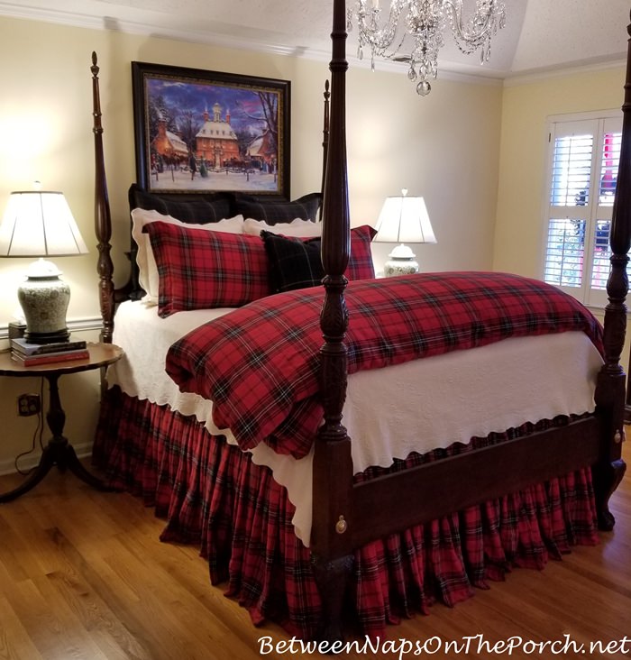
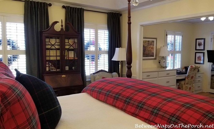
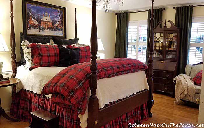
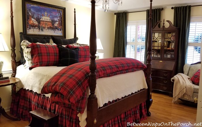
The change I have in mind is a change of wall color for this room. If you’ve been reading BNOTP for while, you know I love this soft yellow that I’ve used in several rooms of my home. The color is Sugar Cookie and it’s an older Duron color.
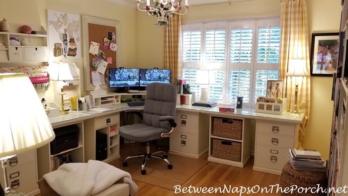
I still very much love it in my home office…
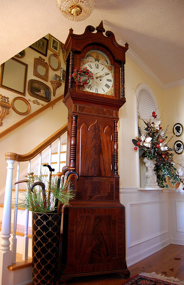
…my entry…
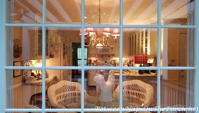
…and my kitchen. I have no plans to change it in any of those rooms.
But I think I’m ready for something different here in my bedroom. I like Sugar Cookie more in the summertime with my summer bedding than I do this time of year with my winter bedding.
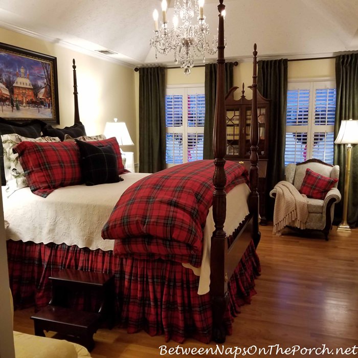
I would also be removing the chair rail. The chair rail was initially installed back in the day when I had wallpaper on the upper half of this room with paint below. I’ve lived here for 31 years now so this room as seen a few changes through the years.

I feel like the chair rail is an unnecessary break in the flow/height of the wall now and just doesn’t add anything. Since I’m thinking of going with a new paint color, this seems like a good time to remove it.

As mentioned, I’ve been thinking about changing the wall color for a while now–adding dark green draperies to this room recently has spurred me on to make that change. I’m just not loving the green with the yellow. Most of the time the yellow looks very pale and neutral, but at times it can appear more yellow, especially now that it’s contrasting against the drapes.
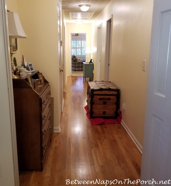
I’ve been doing a bit of research into light, neutral colors. I plan to carry whatever color I choose right out into the upstairs hallway, another area where Sugar Cookie can look really yellow since there are no windows in this hall. (The trunk is no longer in this spot waiting to be moved–I’ve placed in the upstairs living/bonus room for now.)
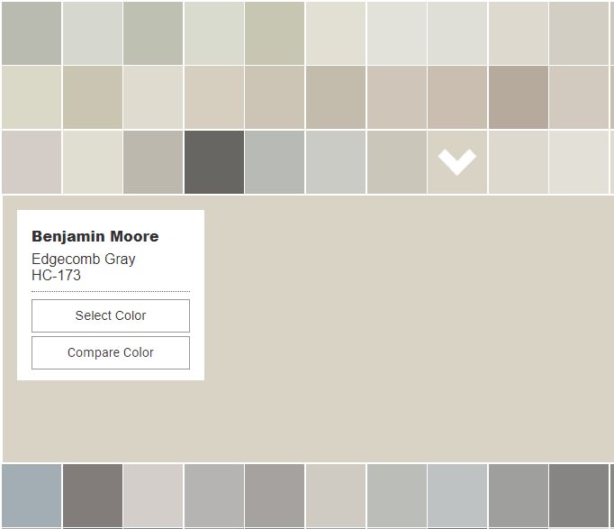
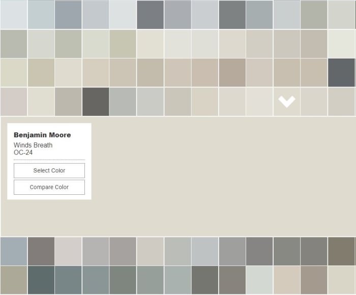
This Benjamin Moore color called Edgecomb Gray is a really popular neutral that I’ve seen used all across Blogland. Have you ever heard the word, greige? I’ve often heard of it but didn’t exactly know what it meant. Apparently, it’s a word to denote any color that’s a combination of Gray and Beige. I’m not a big fan of gray walls, they always feel a bit depressing to me and a bit too cool, but I do like a soft taupe color, especially when it’s contrasting against white trim. This Edgecomb Gray may be a bit darker than I have in mind, so I’ll definitely get a paint sample to try on a large piece of poster board before deciding if it’s THE ONE.
Two more colors I’m considering that are a bit lighter are Pale Oak…

…and Winds Breath. Pale Oak is lighter than Edgecomb Gray and Winds Breath is lighter than Pale Oak. Have you used any of these paint colors in your home, and if so, how did it turn out? I wonder if Winds Breath and Pale Oak are moving toward looking too gray. I definitely don’t want gray walls in this room.
Here’s a great site for comparing a lot of Benjamin Moore neutral paint colors: Neutral Paint Colors. At that site, just click on the color you’re wondering about and it will enlarge so you can compare it to the other surrounding colors. I really like how they’ve made it so easy to compare and contrast the various colors. Update: Check out the comments section for a few more colors I’m considering, like Sandy White or some of the brown/beige tones. Oatmeal is one to consider, too.
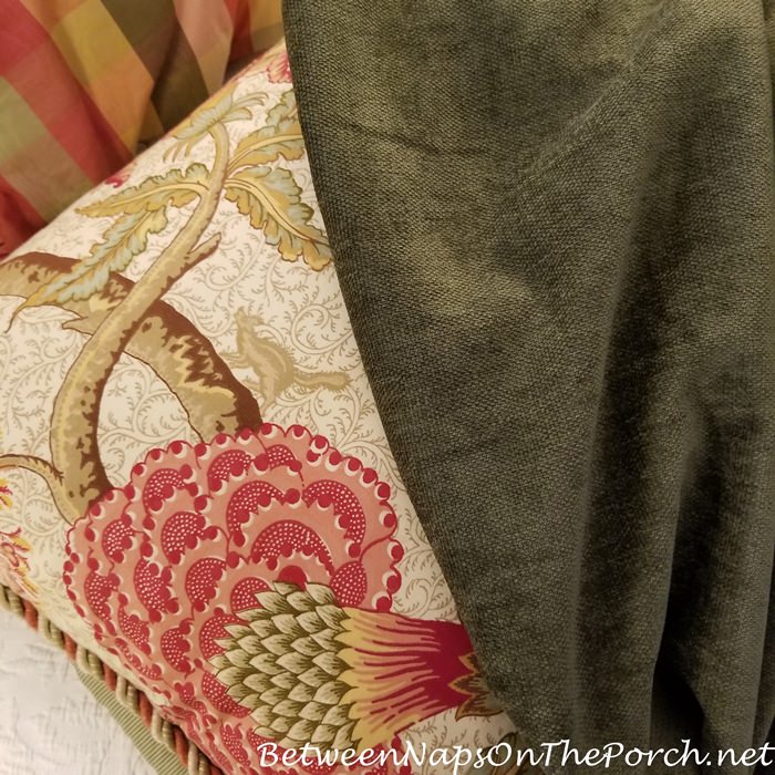
In addition to being a nice backdrop for my fall/winter bedding…
…I think a light taupe will work well as a backdrop for my spring/summer bedding. That bedding actually has a similar color already in the design. Changing wall color makes me nervous, so I’m not going to rush into choosing a color.
By the way, if you’re looking for a great trim color, be sure to check out the trim color Architech, Patrick Ahearn uses in all his homes. It’s a gorgeous color! I’m going to have a sample mixed up and compare it to my plantation shutters to see if it will work for the trim in my bedroom and throughout my home. Patrick shares his secret to getting his favorite trim color here: Ahearn White: Paint Secrets Revealed. Hint: It’s a combination of two Benjamin Moore colors: China White and Linen White. You’ll find a bunch of photos of how Ahearn White looks in many different settings in that article, as well as Patrick’s favorite kind of BM paint when having it mixed.

Patrick has written a book that I really want to add to my decor library. I love his classic, timeless designs–it would be a dream to have a home designed by him! You’ll find his book here: Timeless: Classic American Architecture for Contemporary Living.
Also, you’ll find plenty of drool-worthy renovations and new homes that he’s designed on his Instagram page here: Partick Ahearn Architect. I love how he generously gives away all kinds of architectural tips, designs, and recommendations on both his Instagram page and his Youtube channel. I really enjoy following him in both places!

So what do you think about my plans to change my wall color in the master bedroom? Do you have a paint color that you would recommend for that room? I would love to hear your thoughts and recommendations!
Looking forward to all the great Before and Afters linked for this week’s Metamorphosis Monday!
Pssst: Did you know Between Naps On The Porch is on Instagram? You’ll find me on Instagram here: Between Naps On The Porch.
Like to know when a new blog post is up and available to read? Subscribe for email updates, it’s free and your email will never be shared.
Subscribe for free post updates via email here: Subscribe.
Metamorphosis Monday
Metamorphosis Monday is a party that’s all about Before and Afters. Please link up your Before and After projects like DIY projects, room makeovers, craft projects even recipes. Any Before and After is great! Please do not link up Table Settings, save those for our Tablescape Thursday party on Thursday.
If you are participating in Met Monday, please link up using the “permalink” to your MM post and not your general blog address. To get your permalink, click on your post name, then just copy and paste the address that shows up in the address bar at the top of your blog, into the “url” box for InLinkz when prompted.
In order to link up, you’ll need to include a link in your MM post back to the party so the other participants will have an opportunity to receive visits from your wonderful blog readers.
This party has ended, click button below for the links to all who participated.


Pick a deeper shade of gold/ yellow from your pillow you show! The grey won’t work!
Maybe I should be looking more at the brown tones: https://www.acehardware.com/thepaintstudio/colors#sortby:originalorder|brand:benjaminmoore|palette:benjaminmoore|colorfamily:brown|colorchip:HC-35|
If you love the taupe color in the summer bedding, take a pillow sham to the paint store and ask for a custom color match. I did this a few years ago for our guest room and love the result. It’s still a favorite paint color. Can’t wait to see what you decide on.
Thanks for that suggestion, Lori! Will def keep that in mind.
I’m trying to move away from the yellow, I kinda like Sandy White here: https://www.acehardware.com/thepaintstudio/colors#sortby:originalorder|brand:benjaminmoore|palette:benjaminmoore|colorfamily:brown|colorchip:2148-50|
Definitely don’t want to go too dark.
Go for it! You’ll love the neutral color. It will go with everything! I loved my yellow as well but when I finally decided to paint, I wondered why it took me so long! New paint makes your house feel new again!
Thanks, Gina. I’m def ready for a change in that room, just not loving how yellow the paint turned (at certain times of the day) after I added the dark green drapes.
Paint is so difficult! I find it harder than flooring, which is another thing that takes up a lot of space and visual interest. And the color seems to change throughout the day. Ugh. I hate choosing paint colors! But you did ask, so here’s my two cents.
Your beloved Sugar cookie has given you a certain mood over the years. It’s pale, but it’s ‘happy.’ The greiges all seem severe in comparison, and none seem happy. Maybe that’s okay because maybe you’re in a completely different mood and ready for something entirely different. But if it were me, I would consider a pretty green in the same intensity level as the Sugar cookie. You have green in both your summer and winter beddings, and now in your drapes, and on top of that, it’s your favorite color. So I would encourage you to just take a look at pretty, pale green options and see if there are any you would consider. I think it would leave you with a happier mood than the greiges. Although, even with green you have to be careful because some are more Spring-y and happy and others have more brown and are more subdued. I think you’d be more comfortable with the happy versions.
Well Susan, Christmas has passed and now we’re on to the New Year. I’d like to wish you and all your readers a wonderful 2022. May it be greatly improved over these past two years!
I completely agree. Great big round of applause.
Thanks, Pam! I’m pretty sure I don’t want to go with a green color. I don’t think that would look that great with my summer bedding, just really want more of a neutral on the walls, something that feels soft and inviting, though–and not gray.
Susan, try Samplize.com. I can’t remember the price but you can order 12″x12″ painted samples of Benjamin Moore and Sherwin Williams. There might be other paint companies but those are the 2 I use.
Peg, thanks for suggesting that–will definitely check into it! I had not heard about that site…great to know about it!
I have several samples from Samplize and it makes such a difference to have a larger version. I use green frog tape to move them around. How funny that I am repainting a yellow room too and looking for that perfect softer neutral color.
Go with a taupe that has a more beige tone not grey.
Thanks, Lauren! Yes, that sounds like the direction I would like to go.
Check out Benjamin Moore Revere Pewter. I have it in our master bathroom and a basement powder room. It’s a nice neutral greige.
Thanks for the suggestion, Gina!
My neighbor painted the interior with Edgecomb Gray. It’s really pretty. I love it. I don’t think it’s too dark. Her house has an interior room without windows and it doesn’t look dark in that room.
I am loving the colors you are considering Susan. My bedroom needs a good painting so I will have to check into some of these colors. I like neutral colors on my walls, so usually have a soft white, but am getting tired of the soft white color and would like to have a little bit of color. I did paint my guest room a yellow, and though I don’t hate it, I don’t love it either. It’s a bit to “harsh” and wish it was softer looking. I’m not good at picking paint colors! lol Can’t wait to see what you go with. Hugs, Brenda
Thanks, Brenda! Choosing a great paint color is tricky, for sure. I’ll be sure to share what I end up going with in the end.
I like the linen white – and it will look great with both summer colors and be a great backdrop for winter….
Now, when I look at the photos – I really did not see the chair rail, and I love chair rails – so – was a little surprised that you want to remove it – I think any additional millwork adds elegance to a room, and your home carries a chair rail – style wise – not only is it pricey to get installed… but – there will be a lot of damage to repair to get a smooth wall…. clearly – just my thoughts…
Thank you so much for another year of beautiful home ideas. I hope that 2022 is an amazing year for you and yours.
Ummm, maybe I should leave it. It is kinda hidden behind all the furniture (and now draperies) in the room. Thanks, Maggie!
I like your choices but personally I think they are rather institutional unless you get a lot of light in the room. Have you considered something like the BM linen white you show? Or chantilly lace? It looks warmer and inviting. Hard to tell online though.
Sherwin Williams Roman column worked well in my house, as did their Belgian cream. Or what about deeper with agreeable gray. If you get light, it morphs from warm gray to sandy beige and looks great with white trim and most fabrics (I love it and I usually don’t like gray paint.)
Best, as you know, is to get samples and try out. Can always try mixing at 75 percent or so if a little too deep; my painter told me the more expensive grades of paint have more pigment so that affects the color also.
Best news if you hate it, you can redo it. Know you will find something you love that complements your lovely room!
SW Canvas tan ( does not look tan!) walls and BW linen trim. Have used them in my current as well as my last home. Really works well for me, I’m
asked frequently what color it is. Really enjoy your blog Susan!
Susan, I think most of us can agree that choosing paint is HARD. Knowing how thorough you are with any project I would suggest that you do some research on choosing paint colors. Choosing from a paint strip even though you do poster boards can be expensive and time consuming and still frustrating. I had a living room about ten years ago that some friends still make fun of me for. It looked like a crazy quilt with swatches painted all over the room. I would recommend doing the research and then getting the samples to test in the room. You aren’t in a hurry and this could save you some frustration. I have done a much better job (not perfect) since since I learned more about choosing colors, lightening or darkening a paint, etc. However you go about it I know in the end you’ll enjoy a new color. I’ve found that once I am ready for a change I am ready and so happy once I follow through. Iris
Yes, I remember what a pain it was to paint poster boards and expensive to buy a bunch of samples in the past…that’s so true, Iris. A couple of readers have mentioned a website called Samplize and that looks like a better way to test out paint colors. Their samples are $6 each but at least I wouldn’t have to paint anything. Will def spend a good bit of time in the “research” phase since I will probably hire someone to do the painting this time and don’t want to be disappointed once it’s done. Thanks, Iris!
Look for discounts for samplize. Such as for first time buyer.
Benjamin Moore Putnam Ivory is a beautiful neutral that I’ve used in our main living areas and my office. At the suggestion of a professional painter originally, I think I’ve used it at 50% (just a lighter version using the same tints). It has no yellow undertones, but doesn’t read grey either. Neutrals can be so tricky!
Thanks for that suggestion, Barbara! That sounds lovely!
Susan,
Happy New year!! Thanks again for hosting this lovely party every week! I know how much time and effort goes into doing so and I want you to know that it is greatly appreciated!! Stay safe, healthy and happy!!
Hugs,
Debbie
Most of my house is BM ivory 925 and it’s a -gorgeous- cream, almost like candlelight, lit from within. I too would love to see a place, celery green in your room.
Linda, that sounds beautiful! Another person just mentioned that color, too. Thanks for that suggestion!
I painted BM Pashmina (greige) in my kitchen, morning room, dining room and living room textured walls. It shows different shades depending on which wall it is. Trim is similar to linen..direct match to the faded white cupboards. That’s what I love about BM paints. I have a darker grey in the tray ceilings. Master bedroom is yellow, I’m also considering painting when I get time to research BM colors. Its a southern exposure.
Our house was light yellow when we bought it and I was having trouble arranging the furniture until I realized it was the paint I didn’t like and not the arrangement. We painted the whole place BM Litchfield Grey (part of their historic line) and love it. It’s a warm grey.
Here’s a pinterest shot with yellow on one wall and litchfield on another: https://i.pinimg.com/originals/b3/be/26/b3be26839a2c2e3922df10c8fdc01431.jpg
Hi Susan, I ordered a special formula from BM, but it ended up being just Edgecomb Gray in our kitchen and hearth room. I love it, but it’s a deeper neutral beige. Doesn’t look gray at all. It gives a good contrast with white, but it is not pale at all, but an intense beige color. I used Pale Oak on kitchen cabinets at our last house and it can come off a pale gray/white in a lot of light. I’d go somewhere in between, but still have contrast with the white woodwork. I love to paint, so have fun picking the colors. I’d get some larger “samples” or sample paint cans. Paint is so different in each house and room; also different at each time of day.
Thanks for hosting have a Happy New Year’s week!
Making a paint decision is hard work. I personally would stay away from anything with brown undertones. That is a dark green in the drapes and I think the room would look too “earthy.” Which I don’t think is your aesthetic.
Try your samples in all the different lights of the bedroom too but I am sure you already know that. Good luck!!
I definitely don’t want it to be too earthy…good point, Cynthia! Cozy–yes, earthy–no. 🙂
Hi Susan – I say go for it – try something new – what is so great about paint is if you don’t like it – you can just re-paint and go back to the old color. Can’t wait to see what you choose. Thank you for all your great posts!
Happy New Year!
-Jackie
I know grey has been the go-to color for home decorating for the last several years, but I would strongly recommend that you not use any shade of grey in your bedroom. I don’t think it will work with either of your bedding patterns. What about the cream color that is the background of your summer bedding? That would look beautiful with both, I think. As one follower recommended above, you could have the paint color-matched to the bedding; that way it won’t come out too brown or too yellow, but rather a true cream–almost a linen color.
Yeah, I don’t want to use gray, definitely prefer more of a non-gray neutral. Cream may be the way to go, as long as it doesn’t pull yellow. I’m trying to move away from yellow for this room. Love it in other rooms, just not here. Thanks, Maureen!
Pale Oak is a great color.. I just started using it to refresh rooms. Paint color can “change” due to flooring, other colors in the room… I’ve had great succes with Pale Oak. In my rooms, it doesn’t look gray.
Great to know, thanks Caren!
It is very hard to choose colors. That is why I’ve sometimes had an interior designer help me, or choose a color I love when going to Designer Show Houses. It’s scary!
That being said, I would urge you to strongly think about anything with just beige or grey. Much too depressing. I’m so over the grey institutional, bland and colorless and lifeless rooms that some designers said were all the rage.
I agree with everything one reader named Pam said. I, too, would lean toward the “green” color. I found a “green” that I’ve used in my living room for years. I just love it. It’s called Golden Strand and was by BM -I think. If my husband hadn’t cleaned out the garage and threw away all the paint cans, I’d go look and give you the number.
Don’t let the name fool you to think it’s all golden color. It isn’t. Was in a Symphony Show House. It changes colors during the day. Beautiful. And, I’m looking at it now from my family room and on this cloudy day it has a green tint. I can see it with those gorgeous velvet curtains of yours. Then, can picture it with all your spring-summer changes.
I’m like you and love the color yellow and also have it in different shades in my kitchen, sunroom and my studio and the primary bedroom. It’s such a lovely, soothing and happy color.
Good luck with choosing a color. It can be daunting, but I know you will find something lovely that will work. 🙂
Thanks for that suggestion, Anne! I will check out Golden Strand. I know, choosing paint is so hard because we really want to get it right the first time.
I wasn’t going to comment but reading the other comments gave me courage. One of the things I love about your decorating style is your use of color. I hate the trend of the last 10 or so years of gray, beige institutional-looking colors. It’s very safe, but I don’t like it. Color is tricky and can look tacky, but you are the master of combining color with great style. I have a lot of very similar light yellow in several rooms in my house. It is cheerful and makes me happy. Several people have mentioned shades of green and I agree. I have repainted one of my “yellow” rooms with a lovely subtle moss green and I really like it. I would definitely try large swaths of samples on the wall before you decide and PLEASE leave the chair rail up. Your home is beautiful and I know anything you do will be wonderful and I feel like “negative Nellie” for saying anything at all.
Hi!
I painted my Texas house in Putnam Ivory…and my NH house in Richmond Bisque. Great neutrals by Benjamin Moore. I had a decorator advice for NH and the Putnam Ivory appeared in a Pottery Barn vignette in the store. The Texas house flooded and we moved, but still loved the paint! Both are tan tones. My daughter used Revere Pewter and it is quite dark in a hallway. She repainted.
I always get overwhelmed when it comes time to choose a new paint color. There are sooo many variations of each color to consider. Sometimes I wish there were less colors rather than more 🙂 We’re going to start working on my pantry today. I’m tired of “losing” my pantry items on the too large & deep shelves that are in there now. We bought two vertical organizers by ClosetMaid to install, but first the current shelves need to be cut down and some supports removed. That means I’m going to have to paint the inside of the pantry before the new vertical organizers can go up. I’m going to use Navajo White for a nice neutral in there. That has become my new go to color that seems to work well everywhere. I can’t wait to see how your bedroom makeover turns out – I’m sure it will look beautiful!
Does your paint store have a decorator on duty? Our Benjamin Moore paint dealer is Huntsville Decorating Center. When I remodeled my kitchen and was choosing colors for my cabinets, I was in luck to find the decorator on hand. She pulled Dove White (love, love, love it!) for my upper cabinets. I am thinking that you need to take either photos or samples of the colors in your bedroom with you to the paint store. If there is a decorator, get help from the decorator. On the summer printed fabric you show in your photo, maybe something greenish that marries the colors you have but not exactly would be good. If you have an original piece of that fabric, sometimes along the selvage of the fabric is a whole list of the colors in that fabric, which can be helpful in choosing a wall color. Having said all this, the thought of painting everything or even having it painted gives me a big Ugh! But, I’m certain the finished product will bring about happiness.
Now, about the chair rail. Usually millwork adds to the value of a house. It can also add some warmth and feeling of coziness. I know you think it cuts the wall in half visually and the room to me looks like it may be an 8 or 9 ft ceiling so I fully understand the concern. You must decide how important it is to take off the chair rail as it is a costly move. Will it bring the benefit you desire? is it worth it? You can also talk to the decorator about that too!
I will, ofcourse, be looking at what you choose and how it works for you! Good Luck!
Happy New Year Susan. Your home and decorating choices are lovely. Styles and paint choices of colors are many. And tastes so different. In my opinion your house is full of warm tones. Inviting, cozy and traditional. I have done two of my homes in Blonde, also by Sherwin William. It is darker and more gold than Sugar Cookie. (which I also really like) . And Blonde changes color depending on light in the room. I love it, and have had many requests for the color name (always a nice compliment). I think with your reds, tans and warm wood staying in the warm tones would be a good idea. Whatever your choice, it will be lovely for you.
Well I’ll throw in my 2 cents worth also, lol! I now have my whole downstairs area done in White Down by BM, and am in the process of completing every room upstairs also! I absolutely love it! It seems to blend in with all wood types (our home is over 125 yrs old and all natural wood in it), plus it looks good with all color combinations. I have a lot of red and blue soft furnishings and it is a perfect backdrop. A friend of mine also painted her whole home in this color, but she has a lot of different shades of greys and soft greens. An equally lovely backdrop for these shades also. It is the perfect shade for Bisque colored appliances or Bisque bathroom fixtures. Our trim on inside of bedrooms is done in BM Cloud white with some furniture painted in this color also, and the White Down looks lovely with this too. I feel like I’ve written you a book on why I love this color, but I wanted to give you an overall view on why I choose it, lol. (I did use Edgecomb Grey in our trailer, and did like there, but I did have more greyish blues for fabric.). I’m sure whatever you choose will be lovely, and I’m looking forward to seeing the end result!
Thanks for that suggestion, Julie! I just looked up White Down and it’s a pretty neutral. I think that color would go with both my summer and winter bedding. I will def consider it when getting samples to compare in real life. Thanks for the suggestion!
I am not sure if you can do this with BM colors, but isn’t there a way to take a picture of your room and then apply the paint color you want and it will show you what your room will look like. I have seen that on TV with the add about the man sleeping and his wife puts in purple and bingo, he’s back to sleep again. Come to think of it I think it is BM paint. rls
Paint is so hard, even for the Pros. I’ve checked out Edgecomb Gray in my home and it was too Gray for my preferences, as I’m not really a fan of gray. I always use Samplize first now before buying a test paint can. It saves a lot of work to use those swatches first.
Two things that can really help you. First, Sherwin Williams has a color consultant who is free to work with. They should have someone in your area who understands the lighting of your locale and can help you I did that and was absolutely thrilled with resulting color. Secondly, a blogger named Laurel Bern is great with color choices and has lists of her favorites that I’ve found useful.
I don’t think Gray or greige will show off your curtains or bedding and make them be the focal point. Just my two cents.
Check out Benjamin Moore Quiet Moments. But hold some swatches up to both bedding pieces and see what makes both of them pop.
I’m out of your league regarding paint colors. My bedroom is bright blue! lol
Oh! Be careful with the gray, because on a cloudy dark day your room will seem so gloomy and depressing, especially with the dark drapes! Look for a color with more warmth/light.
I LOVE Edgecomb Gray! It is the color I ended up with in two of our bedrooms. I searched forever and painted close to twenty of the most popular greige paint color samples in our home. Most were from SW and they were all to dark, to cold and “gray” for my home. I needed something warmer and wanted some tan undertones. My rooms are north facing and I’m surrounded by green mountains. I do feel like it picks up some green undertones in my setting during certain times of the day. I’m ready to paint my entire interior in this color, I love it that much. Hope you give it a try and it works for you too!
Paint is so hard, even for the Pros. I’ve checked out Edgecomb Gray in my home and it was too Gray for my preferences, as I’m not really a fan of gray. I always use Samplize first now before buying a test paint can. It saves a lot of work to use those swatches first.
Two things that can really help you. First, Sherwin Williams has a color consultant who is free to work with. They should have someone in your area who understands the lighting of your locale and can help you I did that and was absolutely thrilled with resulting color. Secondly, a blogger named Laurel Bern is great with color choices and has lists of her favorites that I’ve found useful.
I don’t think Gray or greige will show off your curtains or bedding and make them be the focal point. Just my two cents.
Hold some swatches up to both bedding pieces and see what makes both of them pop.
Susan, forgot to mention this in my other comment. I don’t think that you would ever put gray or griege as the bottom charger or tablecloth on any of your table settings, with red plaid on top of that. Treat your room like a tablescape and that might help you choose your color.
So clever!
I have Pale Oak in 2 bedrooms. One gets more sunlight than the other. I think it could be classified as a very pale greige, but does not look gray. I think it leans toward the beige side. It looks good in both rooms. I love it!
Thanks, Dot…that is great to know! It doesn’t look gray to me at this website, either: https://shop.samplize.com/products/pale-oak-oc-20-12×12
I have Edgecomb Gray in almost all of my rooms, and I love it!!! It is perfect for my house. I am still delighted with it after several years!! I call it the perfect color.
My office is painted in Pale Oak. It is really an off white, not a greige. I live in the PNW, so we have many grey days, and it’s not too grey. But it could look totally different, depending on your lighting. Whatever you choose, definitely get as large a sample as you can, try it on different walls at different times of day. Even your light bulbs can make it look different. I really think you will want something warmer. Your tastes really run warmer, and you live in a warmer area. To me, the greiges can look cold in warm light. My son lives in Texas, and just bought a new house. He looked at several houses that had been redone in grey, and they just looked so out of place down there. Up here, where you get a lot of grey days, it looks more natural. If you pull colors from your surroundings I think you will be happier. Maybe more of a khaki would be appropriate? BM OC-8 Elephant Tusk is a nice ivory with a hint of green that wouldn’t be as yellow as your current color, but still on the warmer side and very neutral. I think it would really set off your green drapes.
When I had my whole house painted the woman from BM helping us pick out the colors basically picked the most outstanding color in my rug, drapes, etc- I guess what poster Lori K said….she also recommended BM White Dove for doors and trim- it’s not too bright a white ….
I am definitely not a paint expert…..but I think a lot depends on how much outside light you get in that room…..morning sunshine….sunshine all day…..only afternoon sunshine…..might have an effect on the reflection of paint and light. Also consider what the paint will look like at night when there is no exterior light….only lamp light. Select the paint that makes you happiest whether morning, noon or night.
I get a lot more light during the summer than during the winter. Lighting is so weird during the wintertime. That’s a great point, Virginia about looking at it at night, as well!
I think the colors you are considering are more gray than beige, even if they call them “greige”. I just went through this when looking at paint colors for my condo. I did NOT want anything even remotely gray. I agree with the person who commented that you should consider taking your pillow for a fabric sample with you and match the taupe/beige color family spectrum. So pretty, and I think leaning on the beige side blends with your color scheme for bedding and drapes beautifully. The gray/greige tones clash with the rest of the room. BTW I love your summer bedding and those drapes are gorgeous!
I’ve seen the Pale Oak in two different homes and I thought it looked good in every room, whether the room had plenty of light or not, and also with different styles/colors of furniture and bedding.
Someone else mentioned this, but somehow the idea of a very light, but griegy-green color (not gray), kind of tugs at my imagination for your room, too.
Thank you for the recommendation of the trim color recommended by Patrick Ahearn. It looks like it would be very pretty! I want to check it out myself, because I need to choose a new paint color for my trim, too. I hadn’t heard of him before, but I just checked out your links to his books, Instagram etc. and I think I love him already! 🙂
I happen to love yellow – your current yellow and a similar color I have in some rooms in my house. I just wonder if greige is going to look dull lack the current warmth of your gorgeous home. A family member has mostly gray and white inside their house and it is just so dull and cold. It’s such a personal choice, though.
When we’ve painted rooms in our house, we’ve painted VERY LARGE sections of a wall and lived with it for several days to see how the color changes with the light throughout the day – daylight and also at nightime with lamp light. It’s amazed me how a good color with depth changes slightly throughout the day and how my original choices get thrown out!
Looking forward to reading about your experience!
Hi! Since our new house has an open floor plan for part of the first floor, I had to pick a neutral ‘greige’ that wouldn’t look washed out in the light from the two story windows in the living area but also wouldn’t become too dark in other parts of the space. I ended up with Sherwin Williams’ Colonnade Gray. People have written about it online, here are some of the links:
https://knockoffdecor.com/sherwin-williams-colonnade-gray/
https://www.jimenezphoto.com/best-gray-paint-colors-sherwin-williams/
https://www.kylieminteriors.ca/the-4-best-warm-gray-paint-colours-sherwin-williams/
It definitely looks more taupe than grey in our rooms, but it completely depends on your light. I don’t know how to attach pictures here but I will email you some photos of how it looks in our room.
So many more comments above that I hadn’t read when I wrote my original one!
I am going to throw my vote in on a “green” color. (In quotation marks because there are so many green variations that it’s not one color.)
The right shade of pale green would work with both your summer and your winter bedroom colors, which are so opposite. Plus green paint colors can have so much depth and variation depending on light at different times of day and bring in a warmth and the colors of the outdoors year round…
I just painted my downstairs Edgecomb grey and I absolutely love it! I wanted a light color that wasn’t cold. I tried several BM grays and they were too dark or cold. Edgecomb doesn’t seem to take on other colors and looks great on all my walls no matter what direction they are facing. It is also neutral enough that you can accent it with almost any color.I used pure white trim on all the moldings and the contrast is beautiful.G
Have you ever checked out Laurel Home Blog by designer Lauren Bern? She has wonderful suggestions on BM paint colors.
Hi. I enjoy reading your blog. You should read Maria Killam’s blog. She is a color specialist and her biggest accomplishment Is how to choose the right neutral paint color for your space.
Before painting my current home I read Maria Killam’s blog extensively. Following her colour theory I found the perfect neutral, Resene Tea, 1/8th. needless to say I don’t live in the US and the light here is brighter. It’s all about the undertone. Also agree that Laurel Bern has wonderful neutral advice. You have a gorgeous home!
Hi again. A couple of comments mentioned Laurel Bern. I found her blog to be very informative.
I’ve been searching in my folders of decorating that I’ve done over the years and found the color. It’s by Sherwin Williams and it’s called Gold Strand and the # is SW1400. Don’t let the “beige” fool you when you look online. It is so beautiful when it’s on the wall and does lend itself to change during the day and bring out other colors of the room and fabrics. To me, it’s just a beautiful color. Hope this helps!
Happy New Year!
Stick with a white but with the undertone you want
For 25 years I lived in a house of many deep colors, in a pine forest
6 years ago built a new house that had only newly planted trees- take days if not weeks with your samples on the wall to cover 24 hour and all sorts of weather light-
Weird to me was SW Site White as main color(did some bedrooms, bathrooms, theater room, office in diff colors)
Trim was Alabaster
The Site White changed color throughout the day and in different weather- I loved it – it pulled blue some, sometime gray
SW did offer a color consultant- 90$ but that went to paint purchase- the consultant listened carefully and gave suggestions, then approved choices
In August I moved to 11 year old house- a lot of gray going on- I think it’s agreeable- and some Dorian- it was just painted but had 2 rooms painted and some accent walls painted- as in painting over the accent color, all walls in rooms now the same-
It was interesting- the Dockside blue of the new house office worked nicely in this house- but looks very different- possibly better!
Light and furnishings and trim are so influencial-
Take your time, enjoy the process
I enjoy your blog so much
And boy, do I miss Pier one
Happy New Year
Susan – can I suggest another color path for your consideration. My recommendation is for Benjamin Moore 2143-50 Old Prairie. I used it in a home in a climate that was often gray and dreary in the winter but brightly sunny during the summer. It worked wonderfully – and I know it would work in your bedroom because I have the same plaid fabric you have used in your summer bedding and it played well. Not the usual beige, greige, taupe coloration but you’ve not been focused on the most trendy colors up to now and I think it is worth a look (actually a swatch on the wall which is where all of your top choices are going to end up lol).
Check out BM Berkshire Beige,Revere Pewter,
& Monterey White. All beautiful timeless gray/beige paint colors. Love BM historic colors!
Hi Susan, I have used Edgecomb on my walls and Simple White for the trim throughout my house. i don’t care for gray but Edgecomb in my house with my lighting from the outside is very neutral. It is not gray. It is more of a soft light taupe. I love the color!
Choosing paint is extremely hard for me! When we updated our bathroom in the former house, I bought about 8 different quart samples of various whites, and borrowed the Sherwin Williams fan deck of colors for about a month trying to decide the kitchen and matching existing color in a continuous ioen floor pln thay got refreshed. The condo colors weren’t easy either. But what was super easy was this new house. Most of it was one color – extra white – and the two that weren’t are now. It just made my life simpler doing that, and the various light throughout the house had me originally thinking it was different colors in different rooms. Take your time. You’ll find the right one.
Another thought: whether you use samplize or paint a swatch, the color will be affected by the surrounding color, as opposed to painting a whole wall.
I don’t think all grays are lifeless, grays have beautiful undertones, the right one can make a stunning room. The problem has been people aren’t adding color to their gray rooms. They are using gray everything, gray is supposed to be a backdrop for brighter colors. I personally don’t think you’ll love edgecomb gray. It’s a beautiful color but it can come off looking like a true gray or true beige. I don’t see that you have beige or gray anything in your bedding. If this was my room I would get the background color of the pillow matched, like others have suggested. I think it would be a richer color; not as bright as the sugar cookie, but not as subdued as the beige and gray. There’s my opinion, and of course not being in your house it’s hard to judge. I know whatever you select it will be pretty. Can’t wait to see it! Also check out Maria Killiam’s blog, Color Me Happy. She has tons of information about paint and paint undertones. She’s a true color expert.
I’ve read all the comments, so I don’t think I’m offering advice already given. As some others have suggested, I would recommend keeping your chair railing, but instead of painting them in your trim color, I would paint them in the same color you choose for your walls. I’ve seen it done many times and I think it’s elegant and heightens the walls as you want.
You can look at Maria Killam’s blog. She talks about the undertone of colors, if colors are clean vs dirty (muddy), etc. It’s a great resource for choosing paint colors.
I’d say ditch the chair rail…it’s breaks up the wall space, divides. flows better with it gone. Also the natural linen is what i’m choosing for my bedroom to make it lighter. my hall bath is natural linen and I love it.
disregard the lack of capital letters and run on sentences. I have covid and i’m very weak…i just keep on typing. lol
Picking a wall color is nerve racking. I am painting 3 bedrooms. I wanted just white. Well that is a very hard one to pick also. I found a website— http://www.the creativity exchange.com —- that compared whites. Really helped seeing them next to each other and to see the different tones due to the additive.
Cindy Hattersley Design blog uses Manchester Tan at 50% for a neutral color, a Benjamin Moore color. I have it in my family room and a half bath at 100%. It is not too dark but might be darker than you want. It would go great with your been. Look up Cindy’s site. On her recent post she showed how she used it on kitchen cabinets (50%).
Good luck. I need help now finding area rugs. The paint has been the easy part!!!
Happy New Year.
Hi Susan,
I used Manchester Tan in my foyer and living room and love the neutral color. After trying so many swatches of off white and beige, I am wonderfully happy with the result. When we bought the house it had a goldfish yellow which is so dated. And horrible to live with. Since it was during the beginning of the COVID shutdowns, I had to wait awhile for a painter.
I am now using it in other areas with equally great results. I did not want any Grey or yellow tones in my paint and Manchester Tan solves that issue beautifully.
I think Grey has been around too long and it was always a depressing color to me.
The draperies look fantastic. I think it is a great idea to change the color based on the new drapes. Take your time as I know you will and it will be fantastic. Beware of the greys!
Susan, go look at the rooms at https://dixiedelightsonline.com/ I believe that Pale Oak is the color throughout most of her home. Will give you an idea of what it might look like in a setting.
I’m late to the paint party, but consider the lovely color Wool Skein by Sherwin Williams. I chose it because of the undertones which may work for your home, too. To see a description of this timeless color, visit Jacob Owens Designs. I think you’ll love it.
Linda and Susan, I love Wool Skein too. When updating our newly purchased home, I painted the whole interior with Wool Skein. It provides a terrific backdrop to our furnishings in each room. I recently changed a bedroom and renovated bath to Pale Oak. Love both colors! As you know, the choice really will depend on how the colors in your room reflect on the painted walls. Good luck!
I recently discovered “Linen”, by Sherwin Williams. I’ve beeen a Benjamin Moore follower for years, but have found a few neutral colors from SW that don’t seem to have the undertones like alot of the BM paints. I also used the Sampilize website and found the larger swatches to be very helpful with making a decision. The Linen color is calming and true to the sample color. Good luck!
You may enjoy a youtube channel called The Paint People. They feature and discuss various colors from different lines.
Hi!
I love your red tartan plaid bedding! Can you please tell me where you got the pretty bedskirt? I love your decorating taste and it inspires me here in Michigan – a transplanted Atlanta gal!
Thank you so much!
Warmly,
Judy
Ps: I’d also go with a deeper warm toned yellow/golden shade and not the cold gray or greige color!
Thanks so much, Judy! I think you’re right about the color, the more I think about it, I’m not sure Greige would work in this room. I also want to make sure the color I go with doesn’t detract or affect the new painting I just added above the bed.
Unfortunately, my bedding didn’t come with a coordinating bedskirt so I had to have one made. You can read all about this in these two previous posts.
https://betweennapsontheporch.net/cozy-plaid-tartan-bedding-for-the-winter-bed/
https://betweennapsontheporch.net/how-to-make-a-very-full-bedskirt-for-a-tall-high-bed/
The first post talks about how I found the fabric for the bedskirt and the second post shares how the seamstress made the bedskirt, which turned out to be more complicated than either of us expected.
Hi Susan, I read through all the comments and many offered the same suggestions but no one mentioned the color I chose when I decided to go neutral. I also did not want grey but I needed something updated and not so traditional, and yet traditional enough to go along with my furniture and bedding which are very similar to yours. I decided on BM’s BALBOA MIST. The other close choice was BM’s Cedar Key. The names are a bit off-putting, I thought, but they were just what I was looking for to replace a yellow-based cream that was looking very outdated. Good luck, I know the struggle. I can’t wait to see your choice in the room. Happy New Year!!
Susan, you may already know this, but in case you don’t, one of the most important things to consider is your outside light exposure. Do your windows face south or west? The color of light in the room is warm, more yellow. North or east? The color of light is grayer. This makes a huge difference in how the color will “read” on your walls. Something not gray on the sample can look very different on your walls if you have northern or eastern exposure.
In my east facing bedrooms I make sure any color I choose has warm undertones even if the color is blue. In the sunnier exposures I use cooler undertones otherwise the room reads too hot for me. For example, there are cool yellows and warm yellows. Cool pinks and warm pinks. Also, if you have lots of trees, they too, will cast their green light in the room and affect the wall color.
This cuts out a myriad of options to choose from and by process of elimination makes the decision easier.
Remember, harmony is the goal when choosing a wall color, not a perfect match with curtains or bedding which is easy to become obsessed about. At least for me.
Keeping the undertones of your flooring and fabrics, along with the natural light color in the room in sync will make all the difference.
Thus endeth the lesson. 😉
I was thinking exactly what Pam said about green. It will us a terrific neutral as it can be found in all hues. I think soothing is close to happy in our color vernacular.
It is one of your favorites.
Lighter airy drapes for spring and summer and
the heavier darker green for fall winter will lend added variety and fun for your eyes also.
I used Edgecomb Gray throughout a condo that we own and it was a great choice! The white moldings really complimented the color, as well. Your home is lovely!
We recently moved into a new (to us) house with lots of gray walls – after much deliberation we changed them to BM’s China White and love it! It’s not cold or boring, but a lovely rich color. And, it’s a great background for mahogany/dark woods and gold – it would really be great with your bedroom!
We bought cheap foam boards and painted our sample colors on them – them moved them around the house. It’s faster than ordering samples and because the foam board is stiff it’s easy to prop up in windows or on furniture (and you can re-use with other paints later).
Can’t wait to see what 2022 brings on your blog. 🙂 Happy New Year!
I’m usually not a lover of neutrals. I couldn’t decide between grey or beige for the exterior walls of our mountain house. I chose Greige. Actually, Perfect Greige by Sherwin Williams. I was leaning toward green, but since I had just painted all the interior living spaces Clary Sage, and Livable Green, I decided on Greige…with Green trim!
I have used BM Edgecomb Gray a lot in a variety of spaces with varying levels of natural light. The paint can change slightly in different types of light so check that out for your space. You made me think about chair rail and how much it gets in the way of furniture placement.
I was looking at the color Oatmeal and like Ocean Beach more