Welcome to the 623rd Metamorphosis Monday, a blog party sharing fabulous Before and Afters!
A few weeks back I shared how Lorelei transformed her dining room with paint. Lorelei liked the color I used in my dining room, Benjamin Moore, Raspberry Truffle and decided to use the same color in her dining room.

Beautiful transformation!

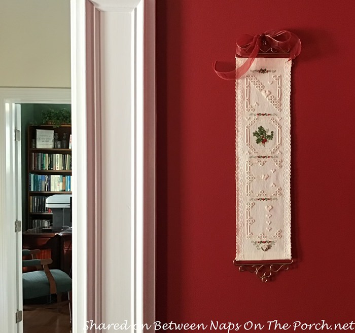
Here’s a picture showing Raspberry Truffle a bit better. Such a great red!
Lorelei also painted her foyer as well. For her entry, she chose Benjamin Moore, Linen White. Linen White is a very popular color, a really pretty neutral. If you would like to see additional photos of Lorelei’s home makeover and her holiday decorations, check out that previous post here: The Magic of Paint: Lorelei’s Dining Room and Entry Transformed.

After I shared Lorelei’s Before/After a few weeks back, I heard from two more BNOTP readers who shared a few photos of their own room makeovers via the magic of paint. Even though I know what a dramatic difference a new coat of paint can make in a room, it still blows me away each time I see the end result.
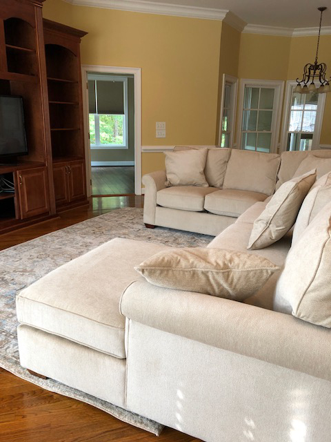
This was Lana’s living room prior to painting. It’s a pretty color but not what Lana and her family wanted for this space.
The color they chose is a Behr color called, Cup of Cocoa. Love that name! Someone jokingly pointed out to me in a comment that the colors I’ve used in my home all had food names: Sugar Cookie, Tea Biscuit and Raspberry Truffle. I wonder if paint companies do that on purpose, choose yummy food names for their colors. lol
Lana’s kitchen was a pale green color, again a pretty color but not quite the look she wanted.
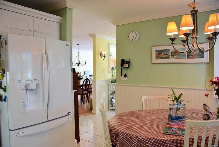
Here’s how Cup of Cocoa looks here in the kitchen. I love the contrast with the trim and the kitchen cabinets. Before the kitchen had a whimsical, cute feel about it. Cup of Cocoa definitely makes it feel more distinguished and grown-up, doesn’t it?
![]()
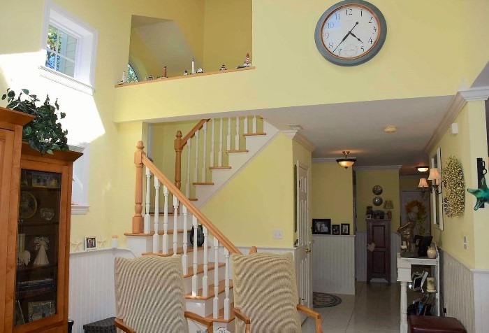
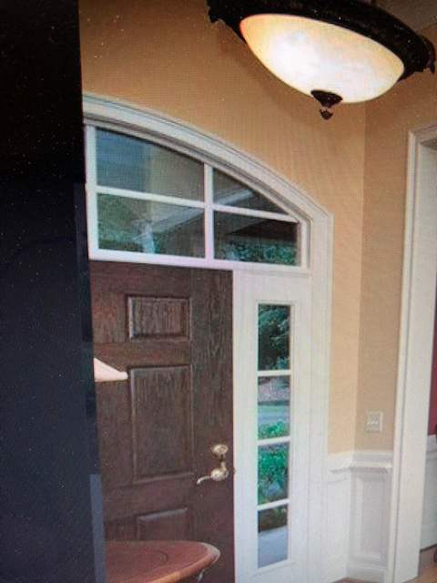
Patricia had a similar look in her home prior to painting. Her living room was painted yellow, too…but in a darker, more golden shade.
The entry/foyer was the same color. Patricia said, “This is the color of the foyer before. We bought this house in 2019 in Columbus GA
I am going through the house & changing the outdated colors. This horrible color was everywhere, kitchen, great room, living room, and foyer.”
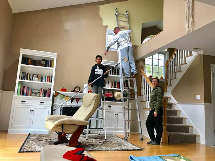
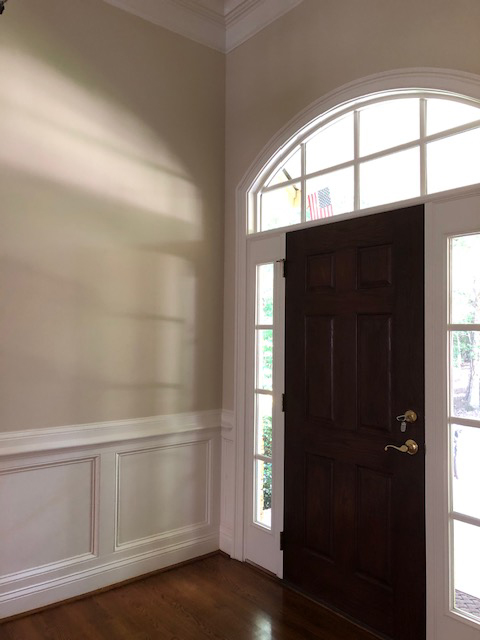
So what color did Patricia choose for her entry and living room?
Patricia went with a beautiful color called, Benjamin Moore color called, Manchester Tan. Patricia said, “Subtle but clean brightness is what it gives to the eye. And it is timeless.”
Thanks so much to Lana and Patricia for sharing their paint transformations! I love seeing the difference paint can make in a room or home. It truly is the biggest way to completely transform the look and feel of a room without spending a lot of money. This is really inspiring me to repaint the upstairs hall in my home that I’ve been wanting to redo for ages. That would be a great project for winter.
Have you transformed a room in your home with paint recently? If so, I would love to see it and share your makeover here on the blog. Pictures can be emailed to me at [email protected].
Happy New Year! Looking forward to a beautiful 2021!
Looking forward to all the wonderful Before and Afters linked for this week’s Met Monday!
Pssst: Did you know Between Naps On The Porch is on Instagram? You’ll find me on Instagram here: Between Naps On The Porch.
Like to know when a new blog post is up and available to read? Subscribe for email updates, it’s free and your email will never be shared.
Subscribe for free post updates via email here: Subscribe.
Metamorphosis Monday
Metamorphosis Monday is a party that’s all about Before and Afters. Please link up your Before and After projects like DIY projects, room makeovers, craft projects even recipes. Any Before and After is great! Please do not link up Table Settings, save those for our Tablescape Thursday party on Thursday.
If you are participating in Met Monday, please link up using the “permalink” to your MM post and not your general blog address. To get your permalink, click on your post name, then just copy and paste the address that shows up in the address bar at the top of your blog, into the “url” box for InLinkz when prompted.
In order to link up, you’ll need to include a link in your MM post back to the party so the other participants will have an opportunity to receive visits from your wonderful blog readers.
This party has ended, click button below for the links to all who participated.


For myself, I find it very difficult choosing wall colors. I admire the courage it takes especially to paint a room a color like raspberry truffle that winds up so beautiful. Loved all these colors!
I’ll be the first to admit that while I LOVE the transformative power of paint, I loathe all the prep work of moving furniture, etc to achieve it. When we renovated and then later downsized (ideal circumstances for painting), it was fun to see the process of what paint does. Choosing colors was very hard for me, but I made a project of it and worked with samples until I was happy. Worth it!
Thank you Susan, Cheers to 2021!
Great transformations! I’ve painted more rooms than I can count, and I love it every time. (Except for that one time when our kitchen ended up lavender … !) So nice of you, Lana, Patricia, and Lorelei to share!
What an amazing change. Do you know where she bought that adorableNoel sign?
I didn’t buy it, I did the Hardanger embroidery myself! Hope you like it!
Lorelei
Before and after paint projects are always fun. And inspirational. I think this is the year to repaint my living room.
Wow – everything looks so fresh and beautiful. Makes me want to go out and paint one of my rooms. It really transforms the look. Thank you for sharing.
-Jackie
Thank you, it was exciting to see my photos on your blog. I have been using that color, Behr’s “Cup of Cocoa” in every house I’ve lived in. I never tire of it. The other rooms you featured were beautiful as well. I’m loving that Raspberry Truffle color, too. – Lana
I have recently repainted the downstairs half bath, a guest bedroom, the master bedroom and last year the entire downstairs (not laundry or kitchen yet, need some work there first.)
I love all the colors but the whites I chose – I get it wrong everytime. The white in the foyer, great room and halls I have grown to like, and it looks really good – I cannot STAND the white I chose for all the woodwork – it is too purple/bright of a white, not neutral enough. Ugh, so expensive paint and so expensive/difficult to change. I freak out everytime I think of it – whites are right or they aren’t.
Had a mishap with my newest accent wall in the master but the SW paint guy created a custom color for us from my error and I love love love it – so sometimes it works out well. Of course that’s one small wall – MY mistakes are the huge huge huge projects that require pros to fix. Not happening.
I am still looking for artwork for above the bed in master, and for a drawer on my antique side dresser to be fixed before I share it on blog and on MM – but it will happen soon now that the holidays are over.
Happy New Year, Susan. Hugs.
Happy New Year!!!Thanks so much for taking the time to host each week!! It truly is appreciated!! Stay safe, healthy and happy!!
Hugs,
Deb
Happy New Year – may 2021 be the best ever for you and your family. Thanks for sharing the paint colors. I love the Cup Of Cocoa. We are three years into our new, downsized apartment. The community we live in “refreshes” your residence every 10 years…flooring, paint, and if you want to upgrade or change anything else. LOL…I already have a file of what I want and Cup of Cocoa is on the list !
Well, we, too, decided to “take the paint plunge”…and painted outside cabin, deck, garage AND boathouse…talk about a “leap of faith!!!” FORTUNATELY, we luv the new look! GO FOR IT!! franki
The power of paint is amazing. The raspberry truffle color is very pretty. Thanks for hosting.
XO- MaryJo
I love seeing what the power of paint does to change a room, not just mine, but everyone’s! Choosing the wrong paint or deciding after the fact that you hate the color is a costly mistake that I cannot afford to do! I am struggling right now choosing a color for my open concept living, kitchen, sunroom, as the are all connected. I want a creamy white or barely a hint of beige, not yellow. Too many choices…… So keep posting your fabulous rooms for us to see and especially identify what paint color and company you used. Thanks, Susan for this wonderful blog!
Love the transformation. Thanks for sharing.
Color is so important to our feeling of well being in our homes, esp. now as we are so confined. When we bought that house in Georgia, I absolutely hated the harsh and dated color of goldfish yellow which was in the foyer, LR, Kitchen and great room. The Manchester Tan is such a transformation to the feeling of the home. Now, I feel better and am enjoying decorating to suit my style. Funny how color can affect your mood.
Now, I am painting the master bedroom a pale shade of taupe with a pink tone to coordinate with a favorite bluish green quil, bed skirt and pillow shams. But I decided to bring the bluish green in to the master bad which is
all tan tile. I chose April Thicket by Valspar. It has really brightened the tan bathroom and looks cheerful.
In, my previous two houses I painted the master bedroom and bath a color exactly like “cup of Cocoa” which Lana used and I loved it for years. Lana’s choice looks perfect for her home. Both the LR and kitchen look great.
Thanks Susan, for putting this discussion together and I am glad I could help in a small way. Happy New Year, Patricia
These were so interesting, Susan! I will not buy a paint unless I like the name of it–a quirk that gave my husband heartburn when it came time to paint a room. I laughed when I heard you had food names–my hall is painted Pecan Sandie by Behr. My kitchen is a bright yellow–Dandelion– can’t remember that paint company name. So neat how color can literally change our lives. Someone told me not to paint a kitchen yellow as it was a color that engendered anger. So far that has not been a problem–everyone loves it. So “stick with what we like” is my motto.
This paint transformation is amazing! I can’t get over the difference. It’s fabulous. Thanks so much for hosting. I hope you and your family had a happy holiday season. Happy New Year, CoCo